Header Menu
The Websby Header Menu
|
|
Websby provides a fully featured Header Menu system. The Header Menu appears on all pages of the website. It can be styled differently than the Home Page for the site's inside pages, however the content is the same.
The Header Menu is accessed through the Root WebSpace Layout Manager, and when the screen first loads, the Menu is collapsed. The image below shows the Websby Header Menu as seen in the Layout Manager, along with a cut out of the same menu as seen on the website itself:
|
Add Table Summary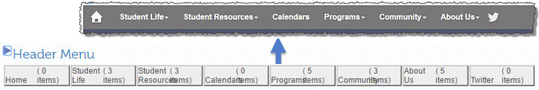
To expand the Header Menu for editing, you click the Expand Icon:  (to re-collapse the menu, click on this icon:
  )
)
Once Expanded, the Header Menu has two representations, The left side is a flat list of all links and it is here where new menu items are added and, after being created, dragged to where they belong on the Menu Bar itself, which is represented visually to the right.
Once a menu item has been created, you can edit it by clicking on it in either location.
Below is an image of the Header Menu in the expanded view
(the image has been shortened by cutting off the bottom links on the left to save space on this page and the two different regions have been artificially shaded)
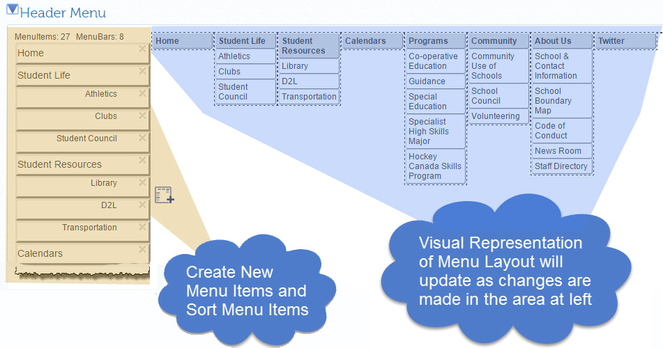
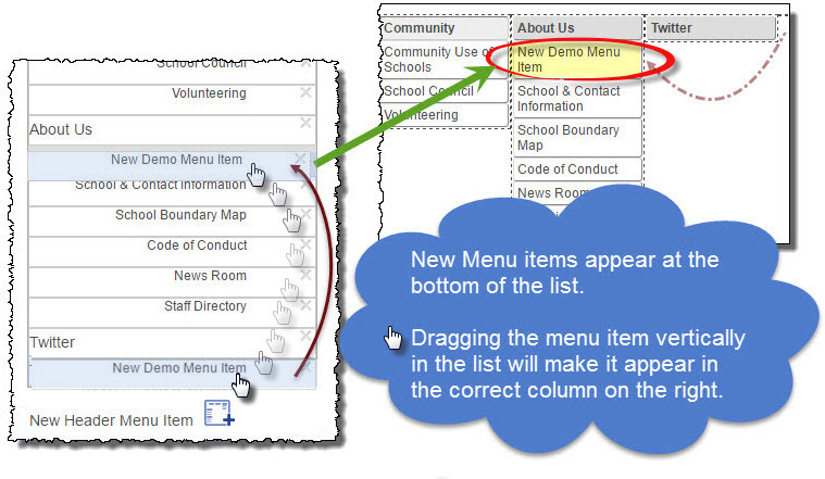
When a new menu item is created, it will appear a the bottom of the list on the left. You can then drag the new menu item to place it where you want it to show on the menu bar. As you make your changes, the changes will reflect on the right menu bar.
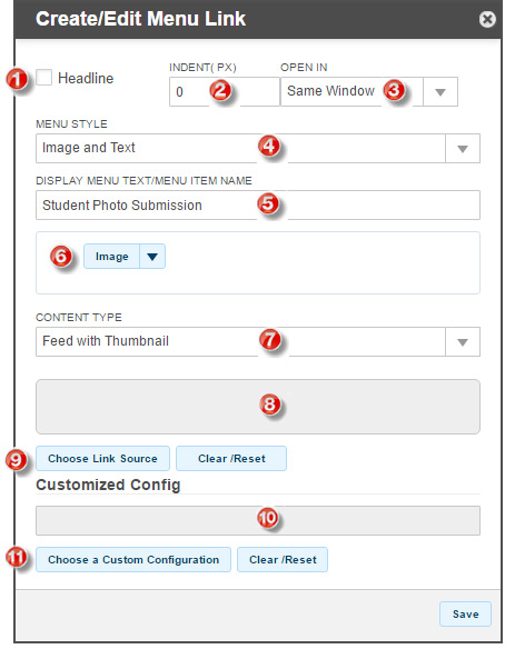
The New Menu Item Form let's you create the actual links on your menu bar. This form is explained below.
Header Menu - Menu Item Form
|
|
|
|

|
If the Headline box is checked, the current link will appear on the main menu bar, to the right of the last menu item with this box also checked. Any menu items after the current one will appear in the drop down menu until the next Headline item, which will start another column.
NOTE: For mobile compatibility, it is not a good idea to make Headlines have links associated with them if there are drop down menu items underneath them.
|

|
The Indent field allows you to indent the current menu item by a specific number of pixels (which you enter). This feature allows you create a visual hierarchy in your menus that can effectively show sub links within the drop down menu.
|

|
External links (links to other web sites) are generally best set to open in a New Window so that you don't lose the visitor to your website. Links to other pages within your site are usually opened in the Same Window
|

|
Websby supports pure menu items that are text only, an image only, or both. The Image selection control (number 6 below) is not visible if the Menu Style is set to Text Only.
|

|
The Display Menu Text / Menu Item Name field is where you enter the text that will appear on the menu bar or in the drop down menu to represent the link. If you are using an image only for the current menu item, you will nonetheless be required to enter text here as it forms the alternative text for the image, required by World Accessibility Guidelines.
NOTE: If entering text for a headline, try to keep the display text fairly succinct as you will want to avoid the menu from wrapping when the screen width is reduced in a tablet (for example) and if there is too much text on the menu bar, this can happen.
|

|
If you intend to display an image only or an image along with text for your menu item, you can use the image browser to locate the image on your computer's hard drive.
NOTE: Due to the way Edsby handles images as of this writing, if you upload an incorrect image for your menu item, you are advised to delete the current menu item and re-create it instead of trying to change the image as the old (incorrect) image may display for a number of hours before changing to the corrected one.
|

|
The Content Type you are linking to can be selected from this list. It is important to understand the content types available in Websby.
 For more information about the content types you can use, click on the Look button to learn more.
|

|
The Link Source area will display the target of your link once you have entered it or selected it from the content browser.
|

|
If the content you wish to link to is within Edsby / Websby, the Target of your link can be found by clicking on this button and searching the content browser. The content browser will display only content that matches the content type you selected in 7 above. If you selected an external link for the content type, this area will be replaced by a text entry box where you can enter the URL of the site you wish to target.
|

|
In some cases the content you are linking to, if it is internal to you system, can be styled differently than it would normally be. This field will display any special configuration form that is associated with your target content.
NOTE: Fields 10 and 11 will only display if the content type chosen supports the use of a custom configuration Form.
|

|
To associate a custom content configuration form with your link, click this button to browse to the list of available configuration forms that are appropriate for the content type you are linking to.
NOTE: Fields 10 and 11 will only display if the content type chosen supports the use of a custom configuration Form.
|